.svg)
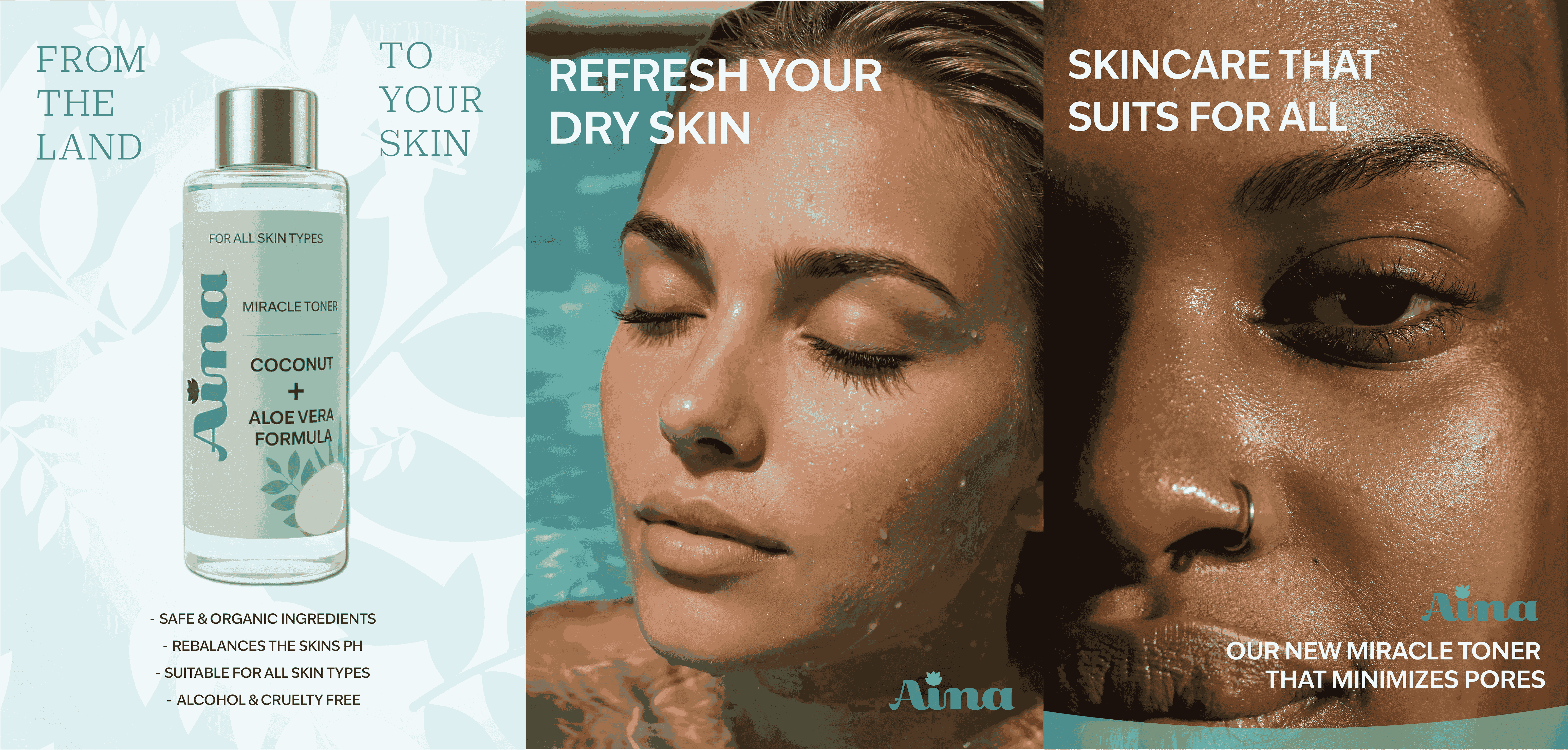
Aina Skincare
We believe everyone deserves skincare that is gentle, effective, and uses safe ingredients. That's why we created a vegan, fragrance free skincare line that works for real people with real skin. No matter your tone, texture, or type. Aina is simple, inclusive, and grounded in nature. Good skin starts with trust.
Ideation + Process Work
The initial concept idea for Aina is that it is a skincare brand with nature based ingredients. It is catered towards every skin type ensuring that all skins receive a natural and glowy finish. The word Aina means “land” or “earth” in Hawaiian.
Thus the saying: "From the land, to your skin."
This skincare brand is for those who sturggle with choosing a proper brand that suits their skin type and want something in which they do not have to worry about harsh chemicals in ingredients or the specific skin type the brand is for.
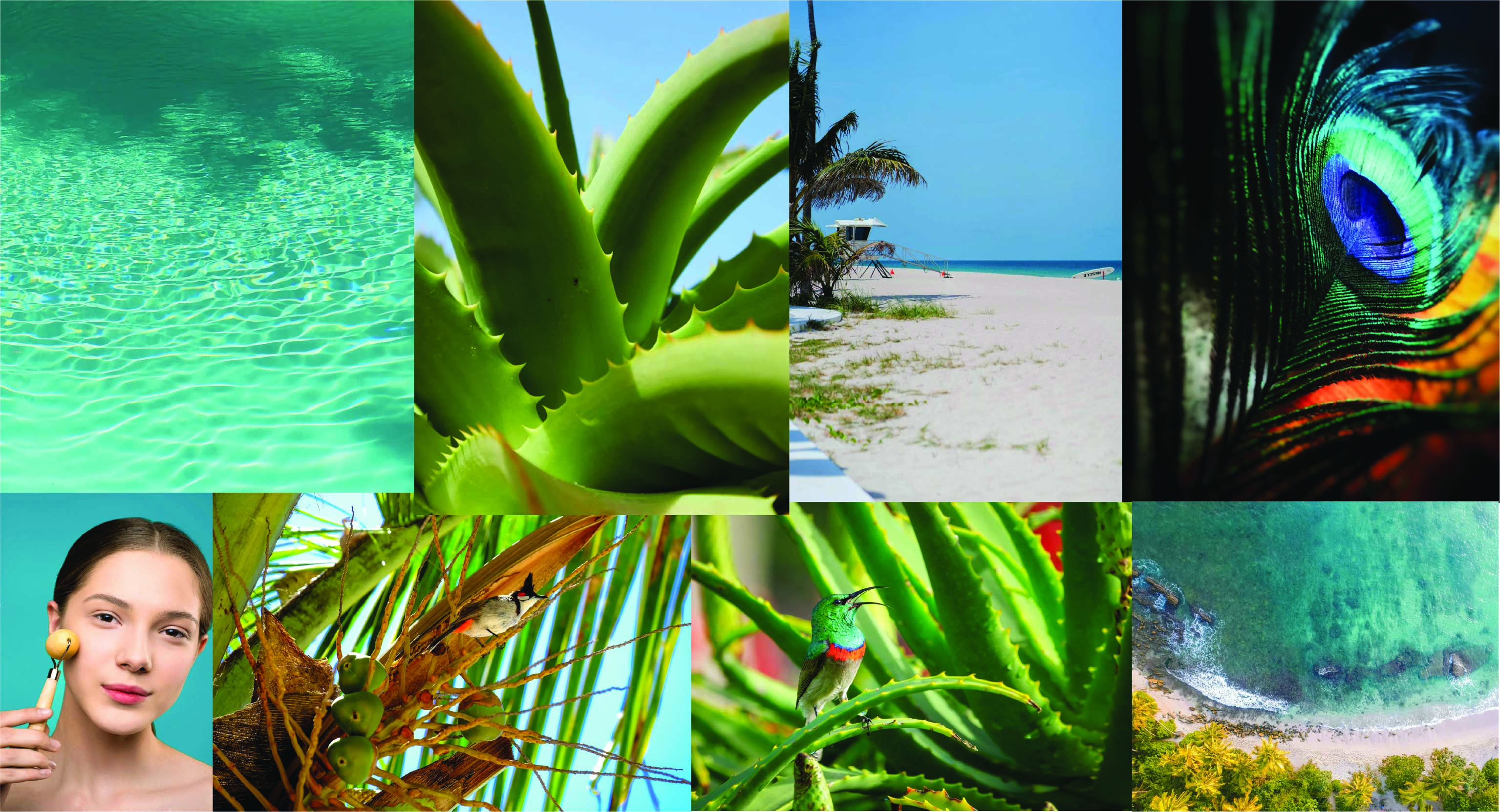
When starting off with my ideation process. I decided to create a moodboard drafting out the concept of what the skincare brand is. Since the name "Aina" is Hawaiian, I went with a tropical theme to encompass it. I then looked up examples from Korean skincare and used inspirations from there packaging designs and advertising. Then I started sketching out the packaging design ideas I had for each variation of the skincare brand.
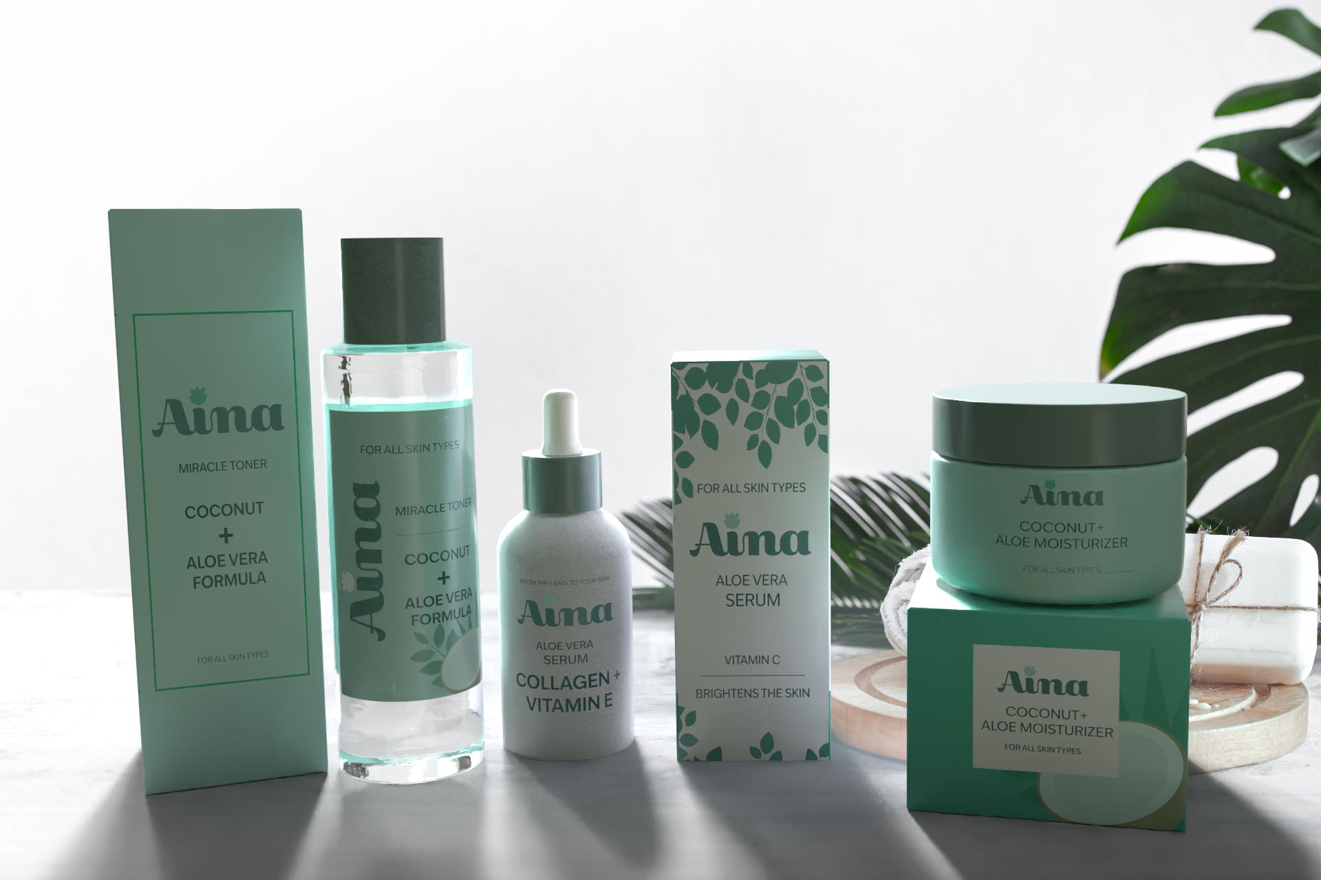
Final Design Variation
Moving onto creating the package design, I used Adobe 3D Dimension to create a realistic mockup of the packaging. Importing 3d models and placing my designs onto them. This was actually my first time using Adobe Dimension.
The most difficult part out of the whole process of this was adjusting and fixing most parts of my design before importing it onto the model. There were times where I felt like the type or design needed to be measured properly and I had to redesign some parts to make it fitting onto the skincare bottles.
When it came to designing the back with the instructions and ingredients, I had to make sure that all words were adjusted and fitting for the packages. After finishing that, I then added a stock image as the background to showcase.
This project was one of my most difficult ones since this was my first time in experimenting with packaging design in a 3d setting and using measurements to fully emunicate how packaging works.
Below you can see the step by step progress as well as some basic advertising design I did for the brand image.